Design a Logo for Uxbridge Pen Works

  • 状态: Closed
  • 奖金: $50
  • 参赛作品已收到: 5
  • 获胜者: dezineerneer

竞赛简介

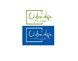
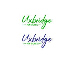
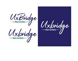
Uxbridge Pen Works is a small craft workshop in Ontario, Canada. We make fine handcrafted pens from wood and acrylics, one at a time, directly for our clients. We need a logo for our website and business cards. Preference will be given to a logo that looks hand written (not too fancy), but are open to other creative options. My favorite colour is Blue, and my wife likes Green. The logo needs to be small enough to fit nicely onto a business card folded in half. The certificate we provide with the pens is a half-fold business card. Thanks to all who enter. Feel free to ask any questions.

您还可能感兴趣的技能

雇主反馈

“Farhat was very responsive. When change requests were made, they were handled quickly and completely. Farhat paid attention to the general updates made on the contest and responded appropriately. I would work with Farhat again. Thank you.”

个人主页照片 UxbridgePenWorks, Canada.

此竞赛的顶尖作品

查看更多参赛作品

公共说明面板

  • vijaypawar61
    vijaypawar61
    • 6 年 之前

    Please check out #115

    • 6 年 之前
  • UxbridgePenWorks
    竞赛主办者
    • 6 年 之前

    Here is what I like so far: 1) Uxbridge in cursive 2) Uxbridge in Blue 3) Pen Works in Green 4) Lines like in # 78 and 5) no boxes. Combine all these elements for the win! "Uxbridge" in cursive must be legible, yet sophisticated.

    • 6 年 之前
    1. dezineerneer
      dezineerneer
      • 6 年 之前

      SIR... CHECK MY FRESH SET OF LOGOS ... #110....ALL WITH CURSIVE , LEGIBLE AND SOPHISTICATED FONTS. IT IS MY LAST ATTEMPT ... HOPE YOU WOULD LIKE IT. THANKS

      • 6 年 之前
  • kasem774270
    kasem774270
    • 6 年 之前

    sir please check #88 thanks

    • 6 年 之前
  • DarkerNights
    DarkerNights
    • 6 年 之前

    sir. please check my design #78#79 thank you,sir

    • 6 年 之前
  • UxbridgePenWorks
    竞赛主办者
    • 6 年 之前

    Thank you for your submissions so far. Some guidance... please use blues and greens only. Also, I am not looking for representation of a bridge. Submissions should be in 2D with no backgrounds. Just the logo as it would be printed. I am still favoring script fonts over other fonts. However, it needs to be legible. Feedback I have gotten on some is that if they don't know what Uxbridge is, they have a hard time figuring out what the word is. If you are going to add a line, think about what it would look like if it was written with a pen.

    • 6 年 之前
    1. dezineerneer
      dezineerneer
      • 6 年 之前

      Hi CH, I have submitted my fresh entry #74 keeping all your above instructions in view...it seems more fluent, simple and stylish. response please. thanks

      • 6 年 之前
  • DarkerNights
    DarkerNights
    • 6 年 之前

    sir. please check my design #66#68#69 thank you,sir

    • 6 年 之前
  • aymanhazeem
    aymanhazeem
    • 6 年 之前

    #extended, #guaranteed, #sealed, #increaseprize.

    • 6 年 之前
  • aymanhazeem
    aymanhazeem
    • 6 年 之前

    #53

    • 6 年 之前
  • aymanhazeem
    aymanhazeem
    • 6 年 之前

    #50

    • 6 年 之前
  • vijaypawar61
    vijaypawar61
    • 6 年 之前

    "Uxbridge" please explain little about it. Or at least meaning?

    • 6 年 之前
    1. UxbridgePenWorks
      竞赛主办者
      • 6 年 之前

      Uxbridge is the name of the town I live in. I believe the word also evokes sentiments of "quality" and "prestige".

      • 6 年 之前
  • aymanhazeem
    aymanhazeem
    • 6 年 之前

    #3 #4

    • 6 年 之前

显示更多评论

如何以竞赛开始

  • 发布您的竞赛

    发起您的竞赛 快速简单

  • 获取众多参赛作品

    获取大量参赛作品 来自世界各地

  • 悬赏最佳参赛作品

    悬赏最佳参赛作品 下载文件-简单!

立即发布竞赛 或者立即加入我们!