Design eines Logos kaufregional.info

  • 状态: Closed
  • 奖金: €100
  • 参赛作品已收到: 77
  • 获胜者: GaryBeharrie

竞赛简介

Kaufregional.info Logo tender

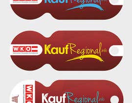
We are looking for a logo for our new kaufregional.info planned Homepage www.kaufregional.info

2 separate words together write. which is to be seen that way. written together, should you like to read individual words also.

Ingredients from Logo: kaufregional.info
The ".info" is not necessarily large.

The logo is like hand-written work "Freehand". The logo "kaufregional.info" consists of 2 words. Purchase Regional. The customer should make purchases locally regional and not on the Internet. It is about the preservation of jobs. There is a unique "word mark" be.

The logo should, if it is small also very readable. In the complex is a key chain on which the logo will look very Readable. It should have a soft line. It may not seem so technical. The logo should look good in several colors. Maybe a script is a good solution. The graphic designer should decide for themselves. Please enter the Google what that means: "purchase regional", or "shopping Regional" The logo should have a correct statement on this subject. The reader must feel concerned, buy in their own country.


It is to be 1 logo, but evident that it consists of two names. The .info may be very small here.

Attention!
The logo shoulderstand be easy to read! The logo shoulderstand not have a cart or other characters. Only the logo shoulderstand be unique. Nor shall a normal PC be Scripture, we can therefore make yourself. It must be very legible in small sizes. We do not need a heart, or else no graphic next to the logo.

Here are a few examples of logo that look good:

https://www.servusmagazin.at/sites/all/themes/sisul/img/logo.png

http://www.tirol.at/portal/assets/images/environment/logo.svg

https://upload.wikimedia.org/wikipedia/en/thumb/b/ba/Disney_Store_logo.svg/1280px-Disney_Store_logo.svg.png

https://static.mailchimp.com/web/brand-assets/logo-dark.png

http://www.lifestyleladies.com/wp-content/themes/lifestyleladies/images/logo.png

http://www.subwaydcw.com/subway-logo.jpeg

https://upload.wikimedia.org/wikipedia/commons/8/87/Clean_Harbors_Logo_RED_rgb_H_space.jpg

http://www.logospike.com/wp-content/uploads/2014/11/Ebay_logo-8.png

http://www.logostage.com/logo/pampers/

http://pngimg.com/download/1651

https://fr.wikipedia.org/wiki/Fichier:Euro_2012_logo.png

您还可能感兴趣的技能

雇主反馈

“Thanks for the quick completion. The communication was always very fast and friendly! The new logo kaufregional.info succeeded nicely.”

个人主页照片 logoboerse, Austria.

公共说明面板

  • Amalbasti
    Amalbasti
    • 7 年 之前

    PLEASE CHECK #106 #107 THANKS

    • 7 年 之前
  • Amalbasti
    Amalbasti
    • 7 年 之前

    PLEASE CHECK MY WORK #104 #105 ..AND FEEDBACK THANKS

    • 7 年 之前
  • logoboerse
    竞赛主办者
    • 7 年 之前

    We produce key ring with chips.

    Since we want to incorporate the new logo and the logo of a sponsor.

    Sponsor: https://upload.wikimedia.org/wikipedia/de/e/ef/Wirtschaftskammer_Österreich_logo.svg

    Keychain Template:http://www.presseteamaustria.at/wp-content/uploads/2016/07/Schlüsselanhänger_Einkaufschip-Vorlage.psd

    Can you visualize so? Only if that looks good, we have success with the new logo.

    • 7 年 之前
  • NAK4Logos
    NAK4Logos
    • 7 年 之前

    pls check#93

    • 7 年 之前
  • GaryBeharrie
    GaryBeharrie
    • 7 年 之前

    hi, just uploaded another variation update for you. thank you, gary. #86

    • 7 年 之前
  • POWERak47
    POWERak47
    • 7 年 之前

    please look at #80

    • 7 年 之前
  • logoboerse
    竞赛主办者
    • 7 年 之前

    One could also use the barcode start something? http://www.etimark.de/blog/wp-content/uploads/2013/01/EAN-13.jpg - There are always good ideas.

    • 7 年 之前
    1. namikaze005
      namikaze005
      • 7 年 之前

      check #58 please

      • 7 年 之前
  • namikaze005
    namikaze005
    • 7 年 之前

    #57 check please

    • 7 年 之前
  • namikaze005
    namikaze005
    • 7 年 之前

    #51 check please

    • 7 年 之前
  • namikaze005
    namikaze005
    • 7 年 之前

    #50 check please

    • 7 年 之前
  • namikaze005
    namikaze005
    • 7 年 之前

    #39 check please

    • 7 年 之前
  • namikaze005
    namikaze005
    • 7 年 之前

    #39 check please

    • 7 年 之前
  • namikaze005
    namikaze005
    • 7 年 之前

    #38 check please

    • 7 年 之前
  • logoboerse
    竞赛主办者
    • 7 年 之前

    KaufRegional.info

    • 7 年 之前
    1. POWERak47
      POWERak47
      • 7 年 之前

      please look at #29 , #30 , #31

      • 7 年 之前
    2. namikaze005
      namikaze005
      • 7 年 之前

      #38 check please

      • 7 年 之前
  • logoboerse
    竞赛主办者
    • 7 年 之前

    2 separate words together write. which is to be seen that way. written together, should you like to read individual words also.

    • 7 年 之前
  • GaryBeharrie
    GaryBeharrie
    • 7 年 之前

    hi, you ask for script font, but now you do not want script font?

    • 7 年 之前
    1. GaryBeharrie
      GaryBeharrie
      • 7 年 之前

      hi, the brief there is a part that says "The logo is like hand-written work "Freehand" and""Maybe a script is a good solution". and all script font logo's you rated low. so do you not want script font anymore?

      • 7 年 之前
    2. GaryBeharrie
      GaryBeharrie
      • 7 年 之前

      hi, ok now all ratings is being swapped.

      • 7 年 之前
  • logoboerse
    竞赛主办者
    • 7 年 之前

    Hier ein paar Logo Beispiele die gut aussehen:

    https://www.servusmagazin.at/sites/all/themes/sisul/img/logo.png

    http://www.tirol.at/portal/assets/images/environment/logo.svg

    https://upload.wikimedia.org/wikipedia/en/thumb/b/ba/Disney_Store_logo.svg/1280px-Disney_Store_logo.svg.png

    https://static.mailchimp.com/web/brand-assets/logo-dark.png

    http://www.lifestyleladies.com/wp-content/themes/lifestyleladies/images/logo.png

    http://www.subwaydcw.com/subway-logo.jpeg

    https://upload.wikimedia.org/wikipedia/commons/8/87/Clean_Harbors_Logo_RED_rgb_H_space.jpg

    http://www.logospike.com/wp-content/uploads/2014/11/Ebay_logo-8.png

    http://www.logostage.com/logo/pampers/

    http://pngimg.com/download/1651

    https://fr.wikipedia.org/wiki/Fichier:Euro_2012_logo.png

    • 7 年 之前
  • logoboerse
    竞赛主办者
    • 7 年 之前

    Attention!
    The logo should be easy to read! The logo should not have a cart or other characters. Only the logo should be unique. Nor shall a normal PC be Scripture, we can also make yourself. It must be very legible in small sizes. We do not need a heart, or else no graphic next to the logo.

    • 7 年 之前
  • GaryBeharrie
    GaryBeharrie
    • 7 年 之前

    hi, just uploaded for you to look at #2 . thank you, gary.

    • 7 年 之前
  • logoboerse
    竞赛主办者
    • 7 年 之前

    in los goes off's

    • 7 年 之前

显示更多评论

如何以竞赛开始

  • 发布您的竞赛

    发起您的竞赛 快速简单

  • 获取众多参赛作品

    获取大量参赛作品 来自世界各地

  • 悬赏最佳参赛作品

    悬赏最佳参赛作品 下载文件-简单!

立即发布竞赛 或者立即加入我们!