mattsrinc
Slovenia

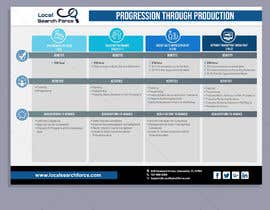
Hello,
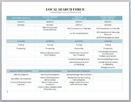
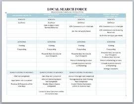
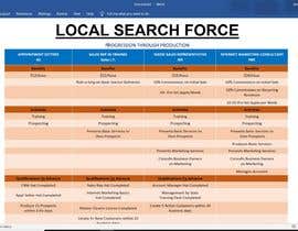
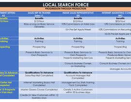
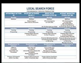
The attached chart is done in its basic form. I have the headings, columns, rows, and text how I want them to be.
What can be improved is the overall presentation of the document. Its on a white background, basic fonts, text rows are not always even, etc.
I think the presentation can be much better with some fine tuning.
Perhaps the columns can be different colors, the Title can be enlarged, etc... I'm not sure exactly what should be done, just think that it can be more aesthetic.
I would like the final in a form that I can make future textual changes without needing design software.
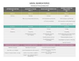
“Destiny did a great job on her design and through the Handover process.”
![]() bombsquad, United States.
bombsquad, United States.