We need a new logo for a tourism group

  • 状态: Closed
  • 奖金: $250
  • 参赛作品已收到: 262
  • 获胜者: nayemreza007

竞赛简介

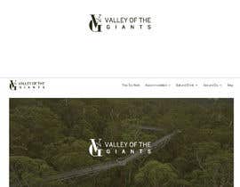
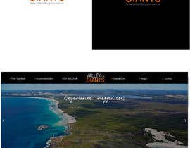
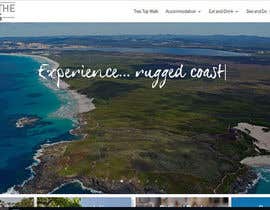
We are a tourism body comprising of 20 - 30 businesses. We have recently created a website for our group at https://www.valleyofthegiants.com.au/

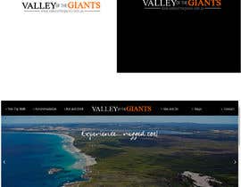
We would like to re-design the logo on the top left hand side of the website. I have also attached the current logo.

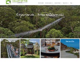
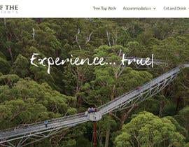
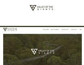
Our geographical area is called the "Valley of the Giants" and we want something professional that represents all of our businesses and our region well.

There are no parameters on this design so please feel free to look through the website and come back with your own original design.

We are after a simple logo, which says "Valley of the Giants" and reflects what our area is about. Less is more!!

您还可能感兴趣的技能

雇主反馈

“Excellent design service thank you”

个人主页照片 VOGHTA, Australia.

此竞赛的顶尖作品

查看更多参赛作品

公共说明面板

  • Votg
    Votg
    • 5 年 之前

    #224 I'd love to see more of your ideas. This one is definitely on the right path with the trees and the trre top walk structure

    • 5 年 之前
    1. RetroJunkie71
      RetroJunkie71
      • 5 年 之前

      Thanks for the feedback, will keep working on it

      • 5 年 之前
  • Nunaram
    Nunaram
    • 5 年 之前

    please check #398

    • 5 年 之前
  • PJ420
    PJ420
    • 5 年 之前

    Please check: #376 #375 #375

    • 5 年 之前
  • Shahadath054
    Shahadath054
    • 5 年 之前

    Sir, Please check #342 Thanks and Regards.

    • 5 年 之前
  • inna10
    inna10
    • 5 年 之前

    sir please check entry #331 #332 thank you.

    • 5 年 之前
  • katrybalko18
    katrybalko18
    • 5 年 之前

    Entry #307 , #306 , #305 , #304

    • 5 年 之前
  • Votg
    Votg
    • 5 年 之前

    UPDATE:
    Thank you for all your submissions, we look forward to seeing what else you come up with. Please have a read of the below feedback to with your future submissions. Showing the logo on the website will help us choose the winner.

    • 5 年 之前
  • Votg
    Votg
    • 5 年 之前

    #4 love the mix of colours and the layout of text. I'd love to see some other ideas of the icon

    • 5 年 之前
  • Votg
    Votg
    • 5 年 之前

    #94 great font and play with sizing. I'd like to see Valley and Giants equally weighted and more of your ideas

    • 5 年 之前
  • Votg
    Votg
    • 5 年 之前

    #119 nice and clean - I think of and the need to be on same line

    • 5 年 之前
  • Votg
    Votg
    • 5 年 之前

    #120 Love the simple addition of the tree - it's getting close to our giant karri trees. The font and colour combination is appealing. I'd love to see some more of your ideas trying different text layouts as per other feedback below.

    • 5 年 之前
  • Votg
    Votg
    • 5 年 之前

    #127 There's something about the font/text layout that really appeals to me with this one

    • 5 年 之前
  • Votg
    Votg
    • 5 年 之前

    #133 love the rotation of the "of the"!!! Like the combination of the VG for the icon too. It kind of looks house shape, anyway of getting a tree in there?

    • 5 年 之前
  • Votg
    Votg
    • 5 年 之前

    #141 really like the text layout I'd love to see some variations with different fonts and colours switched around

    • 5 年 之前
  • Votg
    Votg
    • 5 年 之前

    #142 great mix of colour and addition of icon, heading in the right direction. Can we see it on website please?

    • 5 年 之前
  • Votg
    Votg
    • 5 年 之前

    #144 love the balance and layout of text on this one. The equal balance of Valley and Giants is what the group is look for. I'd love to see it in some different fonts

    • 5 年 之前
  • Votg
    Votg
    • 5 年 之前

    #161 like the concept for your icon, doesn't quite fit though - we'd love to see more of your ideas

    • 5 年 之前
  • Votg
    Votg
    • 5 年 之前

    #162 love the clean colours and the layout of the words, the font isn't quite right for this brand, please keep submitting

    • 5 年 之前
  • Votg
    Votg
    • 5 年 之前

    #169 #170 great use of colour and combining the water and the trees

    • 5 年 之前
  • Votg
    Votg
    • 5 年 之前

    #179 love the clean ness of this design, would love to see some graphic added

    • 5 年 之前
  • Votg
    Votg
    • 5 年 之前

    #197 like this concept of the 2 lines, varying sizes with icon to the left - it's heading in the right direction

    • 5 年 之前
  • Votg
    Votg
    • 5 年 之前

    #206 would love to see more graphics with this design

    • 5 年 之前
  • Votg
    Votg
    • 5 年 之前

    #212 on the right track, if the added graphics could reflect the tall trees it would be great

    • 5 年 之前
  • Votg
    Votg
    • 5 年 之前

    #214 very clever, can we see it on the website please

    • 5 年 之前
  • Votg
    Votg
    • 5 年 之前

    #217 like the use of colour, what about Valley bold as well?

    • 5 年 之前
  • Votg
    Votg
    • 5 年 之前

    #219 love the concept of the V icon, what can you do with trees, the tree top walk frame, the Frankland river, Peaceful Bay etc?

    • 5 年 之前
  • Votg
    Votg
    • 5 年 之前

    #223 I like the icon around the text idea, the icon is not suited though. What other ideas do you have?

    • 5 年 之前
  • Votg
    Votg
    • 5 年 之前

    #227 text is great, plane is wrong. I'd love to see the trees incorporated

    • 5 年 之前
  • Votg
    Votg
    • 5 年 之前

    #228 can you show this on the website

    • 5 年 之前
  • Votg
    Votg
    • 5 年 之前

    #238 I like the play with the letters - using them graphically as well as text

    • 5 年 之前
  • Votg
    Votg
    • 5 年 之前

    #242 wrong icon

    • 5 年 之前
  • Votg
    Votg
    • 5 年 之前

    #244 Can you show this on website please, would like to see with green instead of blue and a different icon

    • 5 年 之前
  • Votg
    Votg
    • 5 年 之前

    #249 would love to see what else you could do with this to depict the tall karri trees

    • 5 年 之前
  • Votg
    Votg
    • 5 年 之前

    #251 Logo looks quite appealing on the top but doesn't look as good on the website

    • 5 年 之前
  • Votg
    Votg
    • 5 年 之前

    #252 I like the tree idea but it's not quite right, the colours and font are appealing. The icon withough definitely looks better

    • 5 年 之前
  • Votg
    Votg
    • 5 年 之前

    #253 can you show this on website header

    • 5 年 之前
  • Votg
    Votg
    • 5 年 之前

    #257 I like the spacing and colour combinations, The icon is going in the right direction showing the valley and river, could be better tiwh tree somehow

    • 5 年 之前
  • Votg
    Votg
    • 5 年 之前

    #261 combination of colours adds interest, font is not suitable

    • 5 年 之前
  • Votg
    Votg
    • 5 年 之前

    #279 interesting use of the different font

    • 5 年 之前
  • Votg
    Votg
    • 5 年 之前

    #283 #284 #285 #286 some great ideas and play with the font and colours the icon doesn't work though. Try searching Valley of the Giants Tree Top walk on Facebook, Instagram or Google to get an idea of the region - think ultimate nature escape, majestic tall karri, jarrah and marri trees, fresh crisp air, amazing produce and creative people.

    • 5 年 之前
  • Votg
    Votg
    • 5 年 之前

    #1 the colour is reflective of the group/area, nice and clean but we need something that helps with branding - an icon or point of difference.
    #2 again nice and clean but a bit too plain and not reflecting the brand
    #3 thank you but too plain
    #4 great mix of colours and styles - would like to see giant trees incorporated
    #5 thank you but too similar to existing
    #6 #7 Nice idea but too plain, we'd like something that is easily relatable to the area and the giant trees
    #8 wrong font - thank you
    #9 thank you - wrong kind of trees and font and colour
    #10 wrong kind of theme. The giants doesn't need to be bold

    • 5 年 之前
  • VOGHTA
    竞赛主办者
    • 5 年 之前

    Hi Everyone, please note - you do not need to make 'giants' in bold. This was on the previous logo but not necessarily needed for this one. Also if possible please show examples of how the logo would look on our web page (screenshot) thanks.

    • 5 年 之前
    1. AdrianActitud
      AdrianActitud
      • 5 年 之前

      Hello, following your idea a bit I was working on this logo proposal to represent your company. A minimalist logo, creative, clean, modern, simple, professional, original, different, representative, easy to use and recognize.
      This logo can be used without any problem in the background of all colors, I hope you like it and please do not forget to leave me your comments and stars. Check #157

      • 5 年 之前
    2. naharffk
      naharffk
      • 5 年 之前

      please check

      • 5 年 之前
  • stebo192
    stebo192
    • 5 年 之前

    #236 please leave me a feedback

    • 5 年 之前
  • yellowdesign312
    yellowdesign312
    • 5 年 之前

    check #234 #235

    • 5 年 之前
  • artistforart
    artistforart
    • 5 年 之前

    please check my new entry #201 #202

    • 5 年 之前
  • DesignExplorer
    DesignExplorer
    • 5 年 之前

    Please check #181 #182

    • 5 年 之前
  • giteshbajaj
    giteshbajaj
    • 5 年 之前

    Dear contest holder, Please have a look at #164 and #166. The entries are shown on you website's screenshot. Regards.

    • 5 年 之前

显示更多评论

如何以竞赛开始

  • 发布您的竞赛

    发起您的竞赛 快速简单

  • 获取众多参赛作品

    获取大量参赛作品 来自世界各地

  • 悬赏最佳参赛作品

    悬赏最佳参赛作品 下载文件-简单!

立即发布竞赛 或者立即加入我们!