Re-design 3 eBook Covers

  • 状态: Closed
  • 奖金: $50
  • 参赛作品已收到: 40
  • 获胜者: vishnuremesh

竞赛简介

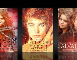
I have 3 books in a YA series. A friend did them one at a time and now the series is finished I feel they need a more cohesive look.

http://www.amazon.com/Heaven-High-East-Lake-Book-ebook/dp/B008FF75QE
http://www.amazon.com/Hells-Earth-East-Lake-Series-ebook/dp/B00BKPRC2S
http://www.amazon.com/Salvation-East-Lake-Book-3-ebook/dp/B00EG06G0I

I have full license for the photo's used, I like the idea of a colour theme for each and they need to fit both Amazon and Smashword sizing, and standout in a thumbnail.

I have included original photos used for the original covers but think I need to reference an ethereal theme.

The books have a theme of heaven/hell, love across a divide and should appeal to a teen reader or older readers who love the YA genre. The main protagonists are clear from books one and two covers-

Book one - the characters fall in love and fight evil
Book two - they struggle being apart physically although he is a spirit presence to her. They break up and make up
Book three - they are united but struggling with the past - and face a big threat to her home town they have to conquer

But love is the overall underlying thread.

If you have any questions, feel free to ask.

您还可能感兴趣的技能

雇主反馈

“Vishnu really listened to the feedback and came back again and again with tweaks and updates to the covers I needed. I can highly recommend him.”

个人主页照片 annaandrews, United Kingdom.

公共说明面板

  • annaandrews
    竞赛主办者
    • 10 年 之前

    OK, so with a day to go we have a couple of front runners. Kiekoomonster has given a flavour of the stories inside and the set really looks professional and cohesive. Vishnuremesh's set really hones in on attractive characters that would appeal to a female YA reader. Very different but both great!

    • 10 年 之前
  • kiekoomonster
    kiekoomonster
    • 10 年 之前

    please rate #57 thanks

    • 10 年 之前
  • annaandrews
    竞赛主办者
    • 10 年 之前

    Just to be clear, the guys in the picture's are all good guys from heaven and the girl is human.

    • 10 年 之前
  • Wackymummy
    Wackymummy
    • 10 年 之前

    Hi, which parts of my designs do you like/not like? :)

    • 10 年 之前
  • annaandrews
    竞赛主办者
    • 10 年 之前

    Thanks for some GREAT entries. I have uploaded more photo's to help. My favourites so far have a sense of magic/supernatural and are giving the three covers a 'linked' look and feel.

    • 10 年 之前
  • vishnuremesh
    vishnuremesh
    • 10 年 之前

    can you upload more photos?

    • 10 年 之前
  • creativemessiah
    creativemessiah
    • 10 年 之前

    In fact you could use my abstract designs on the cover and the face of the author on the back side or as a small thumb nail at the bottom right hand side on the cover
    So using the abstract design with the author's face will be a better idea than using 2 faces...as is there in design 1 and also that of the author

    • 10 年 之前
  • creativemessiah
    creativemessiah
    • 10 年 之前

    I have purposely given abstract designs for cover as yours is a global offering on amazon. Also you need to have a certain level of mystery on the cover to compel the person to pickup the book and read its reveiews. According to research people have their own choice/bias against faces so ideally in an emotional theme like love there should be an abstract design...and please remember there are 3 books in a series and repeating faces in all 3 may make them boring. And you could embed a line from your storyline on the cover to link all 3 books

    • 10 年 之前
  • annaandrews
    竞赛主办者
    • 10 年 之前

    Text colours are pretty but get lost in thumb nail

    • 10 年 之前
  • annaandrews
    竞赛主办者
    • 10 年 之前

    I think 1&2 are more on theme. I like the cohesiveness of 6 7 8 but they don't tell the reader about the stories.

    • 10 年 之前

显示更多评论

如何以竞赛开始

  • 发布您的竞赛

    发起您的竞赛 快速简单

  • 获取众多参赛作品

    获取大量参赛作品 来自世界各地

  • 悬赏最佳参赛作品

    悬赏最佳参赛作品 下载文件-简单!

立即发布竞赛 或者立即加入我们!